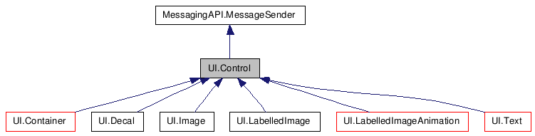
UI.Control Class Reference
#include <class_u_i_1_1_control.h>
Public Member Functions |
|
| validStates () | |
| __init__ () | |
| __del__ () | |
| setNode () | |
| selectable () | |
| setSelectable () | |
| node () | |
| setName () | |
| type () | |
| setType () | |
| A type is a high level descriptor of the
control. |
|
| name () | |
| __str__ () | |
| setPosition () | |
| position () | |
| setSize () | |
| size () | |
| setDepth () | |
| depth () | |
| top () | |
| left () | |
| bottom () | |
| right () | |
| setCallback () | |
| callback () | |
| callbackData () | |
| setData () | |
| data () | |
| setState () | |
| state () | |
| addBuddyHighlight () | |
| Add another control to highlight when this
control is highlighted. |
|
| contains () | |
| Return true if the control contains the
position. |
|
| enter () | |
| This procedure is called when the pointer
position enters the control. |
|
| exit () | |
| This procedure is called when the pointer
position exits the control. |
|
| select () | |
| This procedure is called to select or
deselect the control. |
|
| setTooltip () | |
| showTooltip () | |
| doPosition () | |
| Apply the control's size and position to the
node. |
|
Public Attributes |
|
| string | kNormal = "Normal" |
| string | kHighlight = "Highlight" |
| string | kSelect = "Select" |
| string | kSelectHighlight = "SelectHighlight" |
| string | kDisabled = "Disabled" |
Member Function Documentation
| UI.Control.validStates | ( | ) |
| UI.Control.__init__ | ( | ) |
| UI.Control.__del__ | ( | ) |
| UI.Control.setNode | ( | ) |
| UI.Control.selectable | ( | ) |
| UI.Control.setSelectable | ( | ) |
| UI.Control.node | ( | ) |
| UI.Control.setName | ( | ) |
| UI.Control.type | ( | ) |
| UI.Control.setType | ( | ) |
A type is a high level descriptor of the control.
Two image controls may be of different types, one can be an image, while the other may be a border. This value allows differentiation of control types without having to assume that the differentiator is the name or class name
| UI.Control.name | ( | ) |
| UI.Control.__str__ | ( | ) |
| UI.Control.setPosition | ( | ) |
| UI.Control.position | ( | ) |
| UI.Control.setSize | ( | ) |
| UI.Control.size | ( | ) |
| UI.Control.setDepth | ( | ) |
| UI.Control.depth | ( | ) |
| UI.Control.top | ( | ) |
| UI.Control.left | ( | ) |
| UI.Control.bottom | ( | ) |
| UI.Control.right | ( | ) |
| UI.Control.setCallback | ( | ) |
| UI.Control.callback | ( | ) |
| UI.Control.callbackData | ( | ) |
| UI.Control.setData | ( | ) |
| UI.Control.data | ( | ) |
| UI.Control.setState | ( | ) |
Reimplemented in UI.Image, UI.LabelledImage, and UI.Text.
| UI.Control.state | ( | ) |
| UI.Control.addBuddyHighlight | ( | ) |
Add another control to highlight when this control is highlighted.
Use weak refs so that cycles can be made without causing memory issues
| UI.Control.contains | ( | ) |
Return true if the control contains the position.
Reimplemented in UI.LabelledImage.
| UI.Control.enter | ( | ) |
This procedure is called when the pointer position enters the control.
Change the control state to be highlighted.
Reimplemented in UI.Decal.
| UI.Control.exit | ( | ) |
This procedure is called when the pointer position exits the control.
Change the control state to be normal.
Reimplemented in UI.Decal.
| UI.Control.select | ( | ) |
This procedure is called to select or deselect the control.
Change the control state accordingly.
Reimplemented in UI.Decal.
| UI.Control.setTooltip | ( | ) |
| UI.Control.showTooltip | ( | ) |
| UI.Control.doPosition | ( | ) |
Apply the control's size and position to the node.
Derived classes must override this method.
Reimplemented in UI.Container, UI.Decal, UI.Image, UI.LabelledImage, UI.LabelledImageAnimation, and UI.Text.
Member Data Documentation
| string UI.Control.kNormal = "Normal" |
| string UI.Control.kHighlight = "Highlight" |
| string UI.Control.kSelect = "Select" |
| string UI.Control.kSelectHighlight = "SelectHighlight" |
| string UI.Control.kDisabled = "Disabled" |