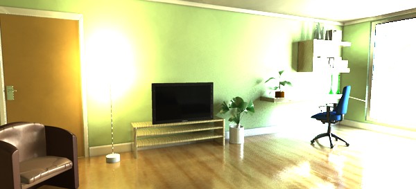
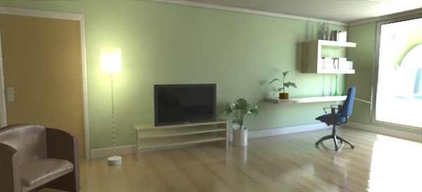
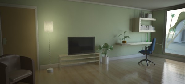
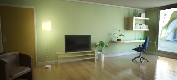
Going from this...
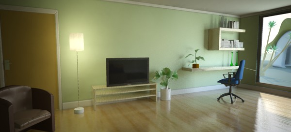
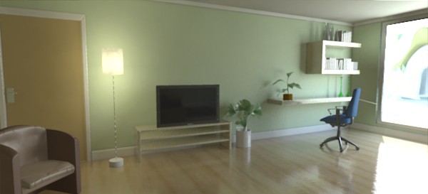
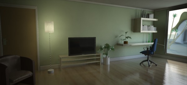
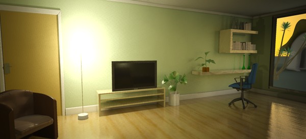
...to this.
When rendering physical light levels one runs into the problem of managing the HDRI output of the real physics vs. the limited dynamic range of computer displays. This was discussed in more detail on page Gamma.
There are numerous shaders and algorithms for doing "tone mapping" (this is a very active area of research within the CG industry), and the architectural library provides two: One very simple shader that simply adds a knee compression to "squash" over-brights into a manageable range, and a more complex "photographic" version that converts real photometric luminances with the help of parameters found on a normal camera into an image.
These shaders can be applied either as a lens shaders (which will tone map the image "on the fly" as it is being rendered) or as output shaders (will tone map the image as a post process).
Since both of these tone mappers affects each pixel individually 1 , the former method (as lens shader) is encouraged, since it applies on the sample level rather than the pixel level.
Also, both of the supplied tone mappers include a gamma term. It is important to know if one is already applying a gamma correction elsewhere in the imaging pipeline (in an image viewer, in compositing, etc.), and if so, set it to 1.0 in these shaders. If one is not applying gamma correction anywhere but simply displaying the image directly on screen with a viewer that does not apply it's own gamma, one should most likely use the gamma in these shaders, set to a value between 1.8 and 2.4.
declare shader  "mia_exposure_simple" (
        scalar  "pedestal"       default 0.0,
        scalar  "gain"           default 1.0,
        scalar  "knee"           default 0.5,
        scalar  "compression"    default 2.0,
        scalar  "gamma"          default 2.2,
        color   texture "preview",
        boolean "use_preview"
    )
    version 1
    apply lens, output
end declare
The operation of this tone mapper is very simple. It does not
refer to real physical luminance values in any way. It simply takes
the high dynamic range color and perform these operations in
order:
That's the theory. What is the practical use of these parameters?
Changing pedestal equates to tweaking the "black level". A positive value will add some light so even the blackest black will become slightly gray. A negative value will subtract some light and allows "crushing the blacks" for a more contrasty artistic effect.
gain is the "brightness knob". This is the main point where the high dynamic range values are converted to low dynamic range values. For example: if one knows the approximate range of color intensities goes between 0 and 10, this value should then be approximately 0.1 to get this range into the desired 0-1 range.
However, the whole point of tone mapping is not to blindly linearly scale the range down. Simply setting it to 0.1 most likely yields a dark and boring image. A much more likely value is 0.15 or even 0.2. But a value of 0.2 will map our 0-to-10 range to 0 to 2.... what to do about that stuff above 1.0?
That's where the compression comes in. The knee level is the point where the over-brights begin to be "squashed". Since this is applied after the gain, it should be in the range of 0.0 to 1.0. A good useful range is 0.5 to 0.75.
Assume we set it to 0.75. This means any color that (after having pedestal added and multiplied by gain) that comes out above 0.75 will be "compressed". If compression is 0.0 there is no compression. At a compression value of 5.0 the squashing is fairly strong.
Finally, the resulting "squashed" color is gamma-corrected for the output device (computer screen etc.)
The use_preview and preview parameters are used to make the process of tweaking the tone mapper a little bit more "interactive".
The intended use is the following, for when the shader is
applied as a lens shader:
preview.exr.preview.exr.preview.exr and immediately tone mapped to
screen.The photographic tonemapper converts actual pixel luminances (in candela per square meter) into image pixels as seen by a camera, applying camera-related parmeters (like f-stops and shutter times) for the exposure, as well as applying tonemapping that emulates film- and camera-like effects.
It has two basic modes:
If the film_iso parameter is nonzero, the "`Photographic" mode is used, and if it is zero, the "Arbitrary" mode is chosen.
declare shader "mia_exposure_photographic" (
        scalar "cm2_factor"         default 1.0,
        color  "whitepoint"         default 1 1 1,
        scalar "film_iso"           default 100,
        scalar "camera_shutter"     default 100.0,
        scalar "f_number"           default 16.0,
        scalar "vignetting"         default  1.0,
        scalar "burn_highlights"    default 0.0,
        scalar "crush_blacks"       default 0.25,
        scalar "saturation"         default 1.0,
        scalar "gamma"              default 2.2,
        integer "side_channel_mode" default 0,
        string  "side_channel",
        color   texture "preview",
        boolean "use_preview"
    )
    version 4
    apply lens, output
end declare
In "Photographic mode" (nonzero film_iso) cm2_factor is the conversion factor between pixel values and candela per square meter. This is discussed more in detail below.
In "Arbitrary" mode, cm2_factor is simply the multiplier applied to scale rendered pixel values to screen pixels. This is analogous to the gain parameter of mia_exposure_simple.
whitepoint is a color that will be mapped to "white" on output, i.e. an incoming color of this hue/saturation will be mapped to grayscale, but its intensity will remain unchanged.
film_iso should be the ISO number of the film, also known as "film speed". As mentioned above, if this is zero, the "Arbitrary" mode is enabled, and all color scaling is then strictly defined by the value of cm2_factor.
camera_shutter is the camera shutter time expressed as fractional seconds, i.e. the value 100 means a camera shutter of 1/100. This value has no effect in "Arbitrary" mode.
f_number is the fractional aperture number, i.e. 11 means aperture "f/11". Aperture numbers on cameras go in specific standard series, i.e. "f/8", "f/11", "f/16", "f/22" etc. Each of these are refered to as a "stop" (from the fact that aperture rings on real lenses tend to have physical "clicks" for these values) and each such "stop" represents halving the amount of light hitting the film per increased stop 2. It is important to note that this shader doesn't count "stops", but actually wants the f-number for that stop. This value has no effect in "Arbitrary" mode.
In a real camera the angle with which the light hits the film impacts the exposure, causing the image to go darker around the edges. The vignetting parameter simulates this. When 0.0, it is off, and higher values cause stronger and stronger darkening around the edges. Note that this effect is based on the cosine of the angle with which the light ray would hit the film plane, and is hence affected by the field-of-view of the camera, and will not work at all for orthographic renderings. A good default is 3.0, which is similar to what a compact camera would generate 3.
The parameters burn_highlights and crush_blacks guide the actual "tone mapping" of the image, i.e. exactly how the high dynamic range imagery is adapted to fit into the black-to-white range of a display device.
If burn_highlights is 1 and crush_blacks is zero, the transfer is linear, i.e. the shader behaves like a simple linear intensity scaler only.
burn_highlights can be considered the parameter defining how much "over exposure" is allowed. As it is decreased from 1 towards 0, high intensities will be more and more "compressed" to lower intensities. When it is 0, the compression curve is asymptotic, i.e. an infinite input value maps to white output value, i.e. over-exposure is no longer possible. A good default value is 0.5.
When the upper part of the dynamic range becomes compressed it naturally loses some of it's former contrast, and one often desire to regain some "punch" in the image by using the crush_blacks parameter. When 0, the lower intensity range is linear, but when raised towards 1, a strong "toe" region is added to the transfer curve so that low intensities gets pushed more towards black, but in a gentle (soft) fashion.
Compressing bright color components inherently moves them towards a less saturated color. Sometimes, very strong compressions can make the image in an unappealingly de-saturated state. The saturation parameter allows an artistic control over the final image saturation. 1.0 is the standard "unmodified" saturation, higher increases and lower decreases saturation.
The gamma parameter applies a display gamma correction. Be careful not to apply gamma twice in the image pipeline. This is discussed in more detail on page Gamma.
The side_channel and side_channel_mode is intended for OEM integrations of the shader, to support "interactive" tweaking as well as for the case where one wants to insert an output shader prior to the conversion to "display pixel values".
This is accomplished by applying two copies of the shader, one as lens shader, the other as output shader. The two shaders communicate via the "side channel", which is a separate floating point frame buffer that needs to be set up prior to rendering.
Valid values for side_channel_mode are:
One may wonder, if one wants to apply the tone mapping as a post process, why not skip applying the lens shader completely? The answer is twofold: First, by applying the lens shader (even though it's output is never used), one can see something while rendering, which is always helpful. Second, the mental ray over-sampling is guided by the pixels in the main frame buffer. If these are left in full dynamic range, mental ray may needlessly shoot thousands of extra samples in areas of "high contrast" that will all be tone mapped down to white in the final stage.
The use_preview and preview work exactly like in the mia_exposure_simple shader described above.
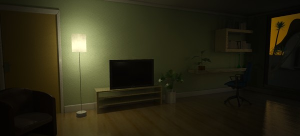
Lets walk through a practical example of tuning the photographic tone mapper. We have a scene showing both an indoor and outdoor area, using the sun and sky, mia_material, and a portal light in the window. The units are set up such that the raw pixels are in candela per square meter.
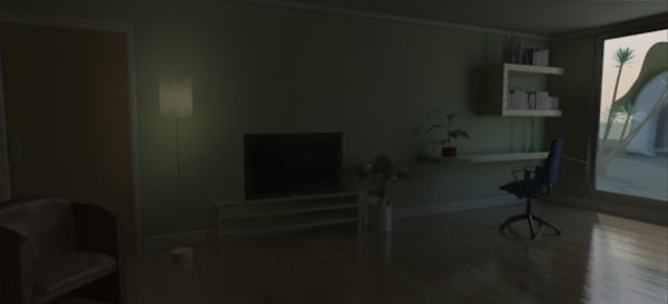
The raw render, with no tone mapping, looks something like this:
This is the typical look of a Gamma=1 un-tonemapped image. Bright areas blow out in a very unpleasing way, shadows are unrealistically harsh and dark, and the colors are extremely over-saturated.
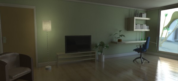
Applying mia_exposure_photographic with the following settings:
    "cm2_factor"         1.0,
    "whitepoint"         1 1 1,
    "film_iso"           100,
    "camera_shutter"     100.0,
    "f_number"           16.0,
    "vignetting"         0.0,
    "burn_highlights"    1.0,
    "crush_blacks"       0.0,
    "saturation"         1.0,
    "gamma"              2.2,
...gives the following image as a result 4:
The settings we used abide by the "Sunny 16" rule in photography; for an aperture of f/16, setting the shutter speed (in fractional seconds) equal to the film speed (as an ISO number) generates a "good" exposure for an outdoor sunny scene. As we can see, indeed, the outdoor area looks fine, but the indoor area is clearly underexposed.
In photography, the "film speed" (the ISO value), the aperture (f_number) and shutter time all interact to define the actual exposure of the camera. Hence, to modify the exposure you could modify either for the "same" result. For example, to make the image half as bright, we could halve the shutter time, halve the ISO of our film, or change the aperture one "stop" (for example from f/16 to f/22, see page f-stops for more details).
In a real world camera there would be subtle differences between these different methods, but with this shader they are mathematically equivalent.
Clearly the f/4 image is the best choice for the indoor part, but now the outdoor area is extremely overexposed. This is because we have the burn_highlights parameter at 1.0, which does not perform any compression of highlights.
The left image subdues the overexposure some. The right image is using a burn_highlights of zero, which actually removes any over- exposure completely. However, this has the drawback of killing most contrast in the image, and while real film indeed performs a compression of the over-brights, no film exists that magically removes all overexposure. Hence, it is suggested to keep burn_highlights small, yet non-zero. In our example we pick the 0.5 value.
Real cameras have a falloff near the edges of the image known as "vignetting", which is supported in this shader by using the parameter of the same name:

The image on the right is interesting in that it "helps" our overexposed outdoors by the fact that it happens to be on the edge of the image and is hence attenuated by the vignetting. However, the left edge turns out too dark.
We will try a middle-of-the road version using a vignetting of 6 and we modify the burn_highlights to 0.25 and get this image:
This image is nice, but it really lacks that feel of "contrast". To help this we play with the crush_shadows parameter:
The crush_shadows parameter deepens the lower end of the intensity curve, and we get some very nice contrast. However, since this image is already near the "too dark" end of the spectrum, it tends to show an effect of darkening the entire image a bit.
This can be compensated by changing the exposure. Lets try a couple of different shutter values, and prevent overexposure by further lowering our burn_highlights value:

The final image is pretty good. However, since so much highlight compression is going on, we have lost a lot of color saturation by now. Lets try to finalize this by compensating:
Now we have some color back, the image is fairly well balanced. We still see something exists outdoors. This is probably the best we can do that is still physically correct.
However, remember we were using the portal lights for the window? These have a non-physical "transparency" mode. This mode is intended to solve exactly this issue. Even though the result we have so far is "correct", many people intuitively expect to see the outdoor scene much more clearly. Since our eyes does such a magnificent job at compensating for the huge dynamic range difference between the sunlit outdoors and the much darker indoors, we expect our computers to magically do the same. Using the transparency feature of the portal lights, this can be achieved visually, without actually changing the actual intensities of any light going into the room:
Now the objects outdoors are visible, while maintaining the contrast indoors. The light level indoors hasn't changed and still follows the real world values (unlike if we had put actual dark glass into the window, which would have attenuated the incoming light as well).
Now this is a mid day scene. What if we change the time of day and put the sun lower on the horizon? The scene will be much darker, and we can compensate by changing the exposure:
Keeping the same settings (left) with the new sun angle makes a very dark image. On the right, all we changed was the shutter time to 2 (half a second). This image has a bit of a yellow cast due to the reddish sunlight, as well as the yellowish incandescent lighting. To compensate, we set the white-point to a yellowish color:
The remaining issue is the overexposure around the lamp (although it would be there in a real photograph), so we make the final image with burn_highlights set to a very low value, yet keep it nonzero to maintain a little bit of "punch":
In conclusion: Photography-related parameters help users with experience in photography make good judgements on suitable values. The intuitive "look" parameters allow further adjustment of the image for a visually pleasing result.
"Bokeh" is a Japanese term meaning "blur", that is often used to refer to the perceived "look" of out-of-focus regions in a photograph. The term "Depth of Field" (henceforth abbreviated DOF) does in actuality not describe the blur itself, but the "depth" of the region that is in focus. However, it is common parlance to talk about "DOF" while refering to the blur itself.
This shader is very similar to the physical_lens_dof in the physics library, but with more control on the actual appearance and quality of the blur.
declare shader "mia_lens_bokeh" (
        boolean "on"          default on,
        scalar  "plane"       default 100.0,
        scalar  "radius"      default 1.0,
        integer "samples"     default 4,
        scalar  "bias"        default 1.0,
        integer "blade_count" default 0,
        scalar  "blade_angle" default 0,
        boolean "use_bokeh"   default off,
        color texture "bokeh"
    )
    version 4
    apply lens
    scanline off
end declare
on enables the shader.
plane is the distance to the focal plane from the camera, i.e. a point at this distance from the camera is completely in focus.
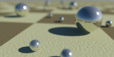

radius is the radius of confusion. This is an actual measurement in scene units, and for a real-world camera this is approximately the radius of the iris, i.e. it depends on the cameras f-stop. But it is a good rule of thumb to keep it on the order of a couple of centimeters in size (expressed in the current scene units), otherwise the scene may come out unrealistic and be perceived as a minature 5.
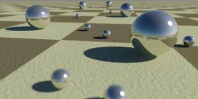
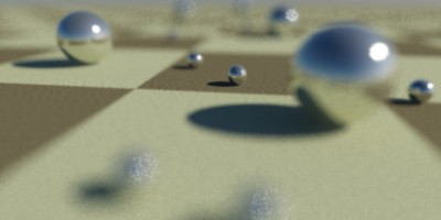
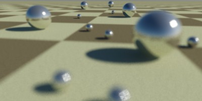
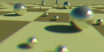
samples defines how many rays are shot. Fewer is faster but grainier, more is slower but smoother:


When bias is 1.0, the circle of confusion is sampled as a uniform disk. Lower values push the sample probability towards the center, creating a "softer" looking DOF effect with a more "misty" look. Higher values push the sample probability towards the edge, creating a "harder" looking DOF where bright spots actually resolve as small circles.


The blade_count defines how many "edges" the "circle" of confusion has. A zero value makes it a perfect circle. One can also set the angle with the blade_angle parameter, which is expressed such that 0.0 is zero degrees and 1.0 is 360 degrees.

The use_bokeh parameter enables the user of a specific bokeh map. When this parameter is used, the parameters bias, blade_count and blade_angle have no effect. The map defines the shape of the DOF filter kernel, so a filled white circle on a black background is equivalent to the standard blur. Generally, one need more samples to accurately "resolve" a custom bokeh map than the built-in bokeh shape, which has an optimal sampling distribution.

With bias at 1.0, samples at 4, blade_count at 0 and use_bokeh off, this shader renders an identical image to the old physical_lens_dof shader.