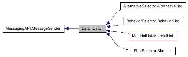
ListUi.ListUi Class Reference
Detailed Description
This class supports arranging controls in a list or tree like structure.
An arbitrary tree of groups and nested subgroups can be specified using ListUiItem and ListUiGroup classes.
Items with in a group can be positioned horizontally or vertically.
Default controls are created here but derived ListUi classes may override createControl(), createGroupLayout(), and createItemLayout() to customize the look.
The ListUi class maintains a "layout" structure that corresponds to the list data. This layout list simply records the position and size of the visual control elements.
Given list data that looks like:
+ Group1 Item1 Item2 Item3 Item4 + Sub-Group A Item5 Item6 Item7 + Sub-Group B Item8 Item9
You will likely want it to look like:
+---+ +-------------------+ | O | | Group1 | +---+ +-------------------+ +-------+ +-------+ +-------+ +-------+ | Item1 | | Item2 | | Item3 | | Item4 | +-------+ +-------+ +-------+ +-------+ +---+ +-------------------+ | O | | Sub-Group A | +---+ +-------------------+ +-------+ +-------+ +-------+ | Item5 | | Item6 | | Item7 | +-------+ +-------+ +-------+ +---+ +-------------------+ | O | | Sub-Group B | +---+ +-------------------+ +-------+ +-------+ | Item8 | | Item9 | +-------+ +-------+
Each box or layout represents where a control is to be positioned. Note that items may be arranged in a horizontal or vertical layout. This behaviour can easily be overriden.
The layout list will simply be an array of positions and sizes indicating the coordinates of each box. ListUi will then call createControl() for each layout in the list that is visible. You may override createControl() to easily customize the type of control created for each type of element.
From this layout list we can calculate the size of the entire tree display. The actual size of ListUi may not be big enough to show all of the tree at once. In this case only the portion of the tree that is visible will be drawn. Consider a tree display that is 250 pixels tall and 125 pixels wide. If the ListUi is only 100 pixels tall then we only want to draw the portion of the tree that is visible.
The self.__myTop member indicates the position where we start drawing. If it is 0 then we draw all controls in the layout list that are fully visible between 0 and 100. If the user has scrolled the ListUi and self.__myTop is now set to 45 then we only draw controls that are fully visible between 45 and 145. Note the maximum value of self.__myTop is indicated by self.__myTopMax and is equal to the height of the entire tree layout subtract the visible height of ListUi. In this example that value is 250 - 100 = 150.
The layout of the actual items is done in the self.__myListContainer member, which is inserted into the self.__myContainer member along with the controls for scrolling (scroll buttons and scroll bar). The position of the scroll controls relative to the __myContainer is determined by __myOrientation and self.__myScrollEdgeOffset which indicate which side the scroll bar should go on and how far from that edge it should be located.
The orientation of the list determines which direction (horizontal or vertical) scrolling occurs in. self.__myTop and self.__myTopMax work the same regardless of the scroll direction and orientation, they just indicate the distance moved in the direction of scrolling. self.__myParallelIndex and self.__myPerpendicularIndex are used to index into 2-tuples indicating size or position. This allows the same code to cause scrolling horizontally or vertically by only changing those two values. This limits scrolling to be either vertical or horizontal but not both simultaneously. If both is needed then a rewrite of this code using some form of clipping (apparently this is tricky/hard) would probably be best.
size() and getControl() refer to __myListContainer, while fullSize() and getFullControl() refer to __myContainer. Derived classes and classes that use listUi should use size() and getControl() when placing items in the list and fullSize() and getFullControl() when positioning the list itself. layoutSize() refers to the total scrollable area of the list, not all of it is necessarily visible.
#include <class_list_ui_1_1_list_ui.h>
Public Member Functions |
|
| __init__ () | |
| getItem () | |
| Derived classes override this to decompose
the data associated with a layout into its corresponding
components. |
|
| getScrollDistance () | |
| Determine the scroll distance required to
bring an item with the given name into view. |
|
| positionInListInPixels () | |
| itemSize () | |
| The size of all item elements. |
|
| groupSize () | |
| The size of all group elements. |
|
| openSize () | |
| The size of all open/close elements.
|
|
| space () | |
| Amount of space between all elements.
|
|
| orientation () | |
| Orientation of list. |
|
| fontSize () | |
| groupType () | |
| itemType () | |
| openType () | |
| openCloseImages () | |
| getControl () | |
| getFullControl () | |
| setScrollEdgeOffset () | |
| Set the offset of the scroll bar from the
edge of the List indicated by self.__myOrientation. |
|
| setUpdateCallback () | |
| Register an update callback. |
|
| setSelectCallback () | |
| Register a select callback. |
|
| setDoubleClickCallback () | |
| Register a double-click callback. |
|
| addDoubleClickRegionCallback () | |
| Adds a double-click vertical region
callback. |
|
| setNumberOfItemsAcross () | |
| numberOfItemsAcross () | |
| setList () | |
| Must be a list of ListUiGroups or an empty
list. |
|
| list () | |
| setPosition () | |
| position () | |
| setSize () | |
| size () | |
| Get the size of the visible region where the
list is, does not include areas for scroll controls. |
|
| fullSize () | |
| Get the full size of the control, including
scroll regions. |
|
| layoutSize () | |
| Get the size of the entire scrollable
region. |
|
| contains () | |
| update () | |
| createControl () | |
| Create a control for the list. |
|
| createGroupLayout () | |
| Create a group layout. |
|
| createItemLayout () | |
| Create an item layout. |
|
| clickRegion () | |
| Determine what area of the list the user
clicked on and then return the types of clicks that the region can
process. |
|
| select () | |
| release () | |
| Set select state back to unselected,
currently only affects scroll bar and scroll buttons Return True if
event is handled. |
|
| highlight () | |
| RenameControlPos () | |
| isScrollableUp () | |
| Return true if the list may be scrolled up.
|
|
| isScrollableDown () | |
| Return true if the list may be scrolled
down. |
|
| scroll () | |
| A positive amount will scroll up. |
|
| dragScroll () | |
| Callback for mouse move and LMB release
events, use to do dragging in the List. |
|
| rollBy () | |
| This starts an animation process. |
|
| rollOnce () | |
| Roll the view up or down by one "sane"
increment, ie. |
|
| rollToEnd () | |
| Roll the view to the bottom, used to ensure
that new items which are created and appended to the list can be
made visible. |
|
| rollToGroup () | |
| Roll the view so that the group represented
by groupName is visible. |
|
| createLockIcon () | |
| Frame () | |
| Perform per frame actions like rolling and
updating of components. |
|
Public Attributes |
|
| string | kClickRegionSingleClickOnly = "SingleClickOnly" |
| string | kClickRegionDoubleClickOnly = "DoubleClickOnly" |
| string | kClickRegionAny = "AnyClicks" |
Member Function Documentation
| ListUi.ListUi.__init__ | ( | ) |
| ListUi.ListUi.getItem | ( | ) |
Derived classes override this to decompose the data associated with a layout into its corresponding components.
Reimplemented in BehaviorSelector.BehaviorList, and ShotSelector.ShotList.
| ListUi.ListUi.getScrollDistance | ( | ) |
Determine the scroll distance required to bring an item with the given name into view.
Pass the returned value to the rollBy() method to do the actual scrolling.
| ListUi.ListUi.positionInListInPixels | ( | ) |
| ListUi.ListUi.itemSize | ( | ) |
The size of all item elements.
| ListUi.ListUi.groupSize | ( | ) |
The size of all group elements.
| ListUi.ListUi.openSize | ( | ) |
The size of all open/close elements.
| ListUi.ListUi.space | ( | ) |
Amount of space between all elements.
| ListUi.ListUi.orientation | ( | ) |
Orientation of list.
| ListUi.ListUi.fontSize | ( | ) |
| ListUi.ListUi.groupType | ( | ) |
| ListUi.ListUi.itemType | ( | ) |
| ListUi.ListUi.openType | ( | ) |
| ListUi.ListUi.openCloseImages | ( | ) |
| ListUi.ListUi.getControl | ( | ) |
| ListUi.ListUi.getFullControl | ( | ) |
| ListUi.ListUi.setScrollEdgeOffset | ( | ) |
Set the offset of the scroll bar from the edge of the List indicated by self.__myOrientation.
| ListUi.ListUi.setUpdateCallback | ( | ) |
Register an update callback.
The callback will be invoked each time the list UI is updated.
| ListUi.ListUi.setSelectCallback | ( | ) |
Register a select callback.
The callback will be invoked each time a control is clicked on with the left mouse button.
| ListUi.ListUi.setDoubleClickCallback | ( | ) |
Register a double-click callback.
The callback will be invoked each time a control is double-clicked with the left mouse button.
| ListUi.ListUi.addDoubleClickRegionCallback | ( | ) |
Adds a double-click vertical region callback.
The callback will be invoked each time a control is double-clicked with the left mouse button if it is within the vertical region. NOTE: For multiple region callbacks, add them in increasing region order. Larger regions will encompass smaller.
| ListUi.ListUi.setNumberOfItemsAcross | ( | ) |
| ListUi.ListUi.numberOfItemsAcross | ( | ) |
| ListUi.ListUi.setList | ( | ) |
Must be a list of ListUiGroups or an empty list.
| ListUi.ListUi.list | ( | ) |
| ListUi.ListUi.setPosition | ( | ) |
| ListUi.ListUi.position | ( | ) |
| ListUi.ListUi.setSize | ( | ) |
| ListUi.ListUi.size | ( | ) |
Get the size of the visible region where the list is, does not include areas for scroll controls.
| ListUi.ListUi.fullSize | ( | ) |
Get the full size of the control, including scroll regions.
| ListUi.ListUi.layoutSize | ( | ) |
Get the size of the entire scrollable region.
| ListUi.ListUi.contains | ( | ) |
| ListUi.ListUi.update | ( | ) |
| ListUi.ListUi.createControl | ( | ) |
Create a control for the list.
Control must use the dimension given in the layout argument.
This method may be overridden in derived class.
Reimplemented in AlternativeSelector.AlternativeList, BehaviorSelector.BehaviorList, MaterialLibrarySelector.MaterialLibraryListUi, MaterialSceneSelector.MaterialSceneListUi, and ShotSelector.ShotList.
| ListUi.ListUi.createGroupLayout | ( | ) |
Create a group layout.
A layout is the size and position for a control.
You may create as many layouts as necessary to represent a group. For example, a typical group may consist of a open/close control with a title control. But you could easily override this method to add as many layouts as you need.
Must return a list of layouts. A layout is a tuple containing the position and size of a control.
( x, y, width, height, data )
Feel free to attach any data desired to the last data parameter.
This method may be overridden in derived class.
Reimplemented in AlternativeSelector.AlternativeList, BehaviorSelector.BehaviorList, MaterialLibrarySelector.MaterialLibraryListUi, MaterialSceneSelector.MaterialSceneListUi, and ShotSelector.ShotList.
| ListUi.ListUi.createItemLayout | ( | ) |
Create an item layout.
A layout is the size and position for a control.
You may create as many layouts as necessary to represent the items. You may layout the items horizontally or vertically or some combination of the two.
Must return a list of layouts. A layout is a tuple containing the position and size of a control.
( x, y, width, height, data )
Feel free to attach any data desired to the last data parameter.
This method may be overridden in derived class.
Reimplemented in AlternativeSelector.AlternativeList, BehaviorSelector.BehaviorList, MaterialList.MaterialList, MaterialSceneSelector.MaterialSceneListUi, and ShotSelector.ShotList.
| ListUi.ListUi.clickRegion | ( | ) |
Determine what area of the list the user clicked on and then return the types of clicks that the region can process.
Use to prevent both the select and the double click calls to happen when a double click occurs. Position should be relative to the bottom left corner of the control.
Could be overridden in derived classes.
Reimplemented in AlternativeSelector.AlternativeList, BehaviorSelector.BehaviorList, MaterialLibrarySelector.MaterialLibraryListUi, MaterialSceneSelector.MaterialSceneListUi, and ShotSelector.ShotList.
| ListUi.ListUi.select | ( | ) |
| ListUi.ListUi.release | ( | ) |
Set select state back to unselected, currently only affects scroll bar and scroll buttons Return True if event is handled.
| ListUi.ListUi.highlight | ( | ) |
| ListUi.ListUi.RenameControlPos | ( | ) |
| ListUi.ListUi.isScrollableUp | ( | ) |
Return true if the list may be scrolled up.
| ListUi.ListUi.isScrollableDown | ( | ) |
Return true if the list may be scrolled down.
| ListUi.ListUi.scroll | ( | ) |
| ListUi.ListUi.dragScroll | ( | ) |
Callback for mouse move and LMB release events, use to do dragging in the List.
Currently only used for the scroll bar.
Takes the current mouse position, whether the LMB is down, the time of the event and arbitrary data that can be specified on the original mouse down event (select)
| ListUi.ListUi.rollBy | ( | ) |
This starts an animation process.
After this is called, during each tick, the list elements will roll in the given direction until the roll amount is complete. This function takes a single argument; the distance to scroll the layout.
| ListUi.ListUi.rollOnce | ( | ) |
| ListUi.ListUi.rollToEnd | ( | ) |
Roll the view to the bottom, used to ensure that new items which are created and appended to the list can be made visible.
| ListUi.ListUi.rollToGroup | ( | ) |
Roll the view so that the group represented by groupName is visible.
| ListUi.ListUi.createLockIcon | ( | ) |
| ListUi.ListUi.Frame | ( | ) |
Perform per frame actions like rolling and updating of components.
Member Data Documentation
| string ListUi.ListUi.kClickRegionSingleClickOnly = "SingleClickOnly" |
| string ListUi.ListUi.kClickRegionDoubleClickOnly = "DoubleClickOnly" |
| string ListUi.ListUi.kClickRegionAny = "AnyClicks" |