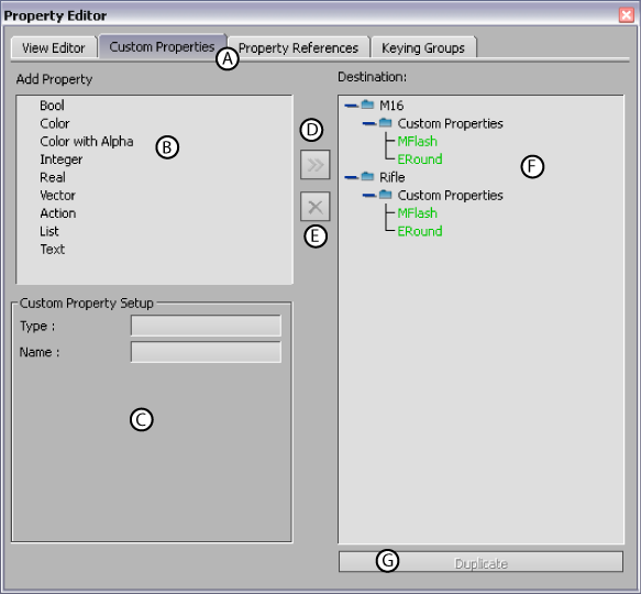
The Custom Properties pane lets you add your own properties to all selected objects in MotionBuilder. You can modify and animate the properties you create just as you would other properties.
For example, you can add check boxes, sliders, and value fields to trigger specific actions, create a custom animation interface, or simply store information you need to export to other software packages.
The Custom Properties pane consists of the following:

Properties Editor A. Custom Properties pane B. Add Property area C. Custom Property Setup area D. Add button E. Remove button F. Destination area G. Duplicate button
The Add Property area contains the list of property types you can add to selected elements. Select a property in the Add Property area, then click then Add button to add the property to a selected element in the Destination area.
You can assign the following property types:
| Bool | Creates a check box for the selected object. Use this option to create a property that you can activate or disable. |
| Color | Creates a set of value fields that represent red, green, and blue color values. |
| Color with Alpha | Creates a set of value fields that represent red, green, blue, and alpha values. |
| Integer | Creates a slider and a value field that can contain only integer values. Use the Min and Max fields to define the slider for this property. |
| Real | Creates a slider and a value field that can contain any real number. Specify the minimum value and the maximum value for the slider using the Min and Max fields. |
| Vector | Creates a set of value fields that represent a set of X, Y, and Z position values. |
| Action | Creates a button for the selected object. You can use this Action button to trigger scripts Relations and Expressions constraints. |
| List | Creates a menu (drop-down list) for the selected object. You can use this menu to trigger scripts or Relations and Expression constraints. |
The Custom Property Setup area displays the settings of custom properties you select in the Destination area. The settings that display correspond to the type of property that is selected. These settings include the following:
| Type | Displays the type of property that is selected in the Destination area. This is useful after you have renamed the property. |
| Name | Lets you rename the property selected in the Destination area. |
| Minimum Value | Defines the minimum value that can be set for this property using the slider. By default, the minimum value is set to 0. Used for Integer and Real property types. |
| Maximum Value | Defines the maximum value that can be set for this property using the slider. By default, the maximum value is set to 100. Used for Integer and Real property types. |
| Text field | Lets you write text for the List property selected in the Destination area. |
The Add button lets you add selected properties from the Add Property area to the element in the Destination area.
When there are multiple elements in the Destination area, select an element there before clicking the Add button. Otherwise, the custom property may not be added to the element you want.
The Destination area lists selected elements, and the custom properties you assign to them. The Destination area also lets you rename, delete, and duplicate properties.
To rename a custom property, right-click it in the Destination area, select Rename Custom Property, type in a new name in the dialog box that appears, and click OK to confirm the change.
To delete a custom property, right-click it in the Destination area and select Remove Custom Property.
You can also copy a custom property selecting it in the Destination area, then clicking the Duplicate button.