Use the following tips to define an easier and faster workflow when using the Hypergraph.
To show a shape’s upstream and downstream connections, select it before you go to the DG view. It is not enough to select the transform parent.
If you select multiple nodes in the DAG view, the DG graph containing all selected nodes is displayed when you go to the DG view.
The node type for a given DG node is displayed in the pop-up window only during mouse-over feedback.
Connection lines in the DAG view may clip when you scroll one node out of view. (This includes DG connections and IK handle joint span lines.)
To improve performance when viewing large graphs, DAG connections are not drawn while the view changes.
Use the Create Asset node feature to create logical groupings within the dependency graph. Asset nodes simplify the display of the dependency graph display by letting you organize nodes into groupings that are meaningful to your production pipeline. For more information, see Create assets.
You can condense multiple connections from one node to another using Options > Merge Connections. This displays all parallel connections as a single bold connection. If you mouse over a bold connection line, the Hypergraph displays the names of all connections that line represents.

Merged connections originating from asset nodes are drawn with a small box attached. A solid box indicates that all the merged connections are published attributes. An empty box indicates that one or more of the merged connections are from unpublished internal attributes. For more information on assets, see Assets Overview.
You can visually review the performance impact of various nodes in your scene using the Heat Map Display option in the Hypergraph.
When Heat Map Display is on, Maya colors the nodes in the Hypergraph according to the node’s timed performance. You can monitor many different metrics using Heat Map Display, including the number of callbacks, computational calculations, dirty updates or draw times. Nodes that take longer to perform in the specified metric are colored from blue to red as they pass various thresholds. This allows you to quickly identify expensive or inexpensive nodes.
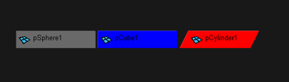
By default, the color scheme of the Heat Map Display is as follows:
Colors are measured by percentage. By default, the node with the highest timing value in the network is red while the node with the lowest non-zero timing value in the network is blue. Values between the low and high timing value appear in a spectrum from blue to red. You can customize the upper or lower threshold or remove nodes above or below a certain performance threshold in the Heat Map Display options.
The heat map is recalculated at the end of each playback, or when you click Redraw HyperGraph(s) in the Heat Map Display options.
You can customize the colors used in the Heat Map Display by selecting Windows > Settings/Preferences > Color Settings, then selecting the Hypergraph setting and adjusting the various Heat Map colors.
 Except where otherwise noted, this work is licensed under a Creative Commons Attribution-NonCommercial-ShareAlike 3.0 Unported License


