There are several button styles on the Backdraft Conform interface.
The following table illustrates the button types and fields, and
describes their functions and purpose.
| Item |
Appearance |
Use |
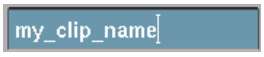
| Text field |
Blue recessed box.
|
Enter text.
NoteA black field indicates
a non-editable field.
|
| Numeric field |
Blue recessed box with an indicator along the bottom showing
the current value relative to the permissible range.
|
Enter numeric values.
NoteA black field indicates
a non-editable field.
|
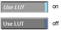
| Toggle button |
Grey button with a blue bar on the right side.
|
Toggle the status of the item on or off. When enabled,
the button is recessed and text appears in italic face.
|
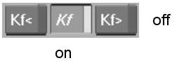
| Radio button |
Same as toggle button, except the bar on the right is dark
grey.
|
Choose a mode from a series of mutually exclusive options.
In a radio button series, only one can be “on” at
a time. Turning one on causes any other in the series to turn off.
|
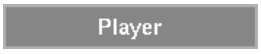
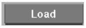
| “Action” button |
Grey raised button.
|
Initiate an action, such as process or “undo”. |
| Option box |
Blue raised button.
|
Click and hold to display a pop-up menu of options. In
some cases, the selected option is an action you can perform by clicking
the box—this is indicated by the text on the box being centered.
An example of this is the Output/Assemble box in the Clip Output
menu.
|
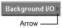
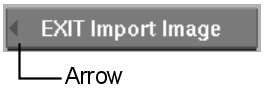
| Button arrow |
A dark grey arrow on the left or right side of a button.
|
Arrow on the right side indicates that pressing the button
brings you deeper into the item's menu structure or into an alternative
menu. Arrow on the left indicates that pressing the button takes you
out of the menu structure.
|
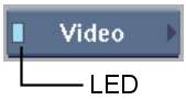
| LED indicator |
A square coloured “light” on a button.
|
Status indicator. Blue indicates that the status is “on” or “active.” Dark
grey indicates that the status is “off” or “inactive.” Yellow
indicates that the status is “muted.”
|
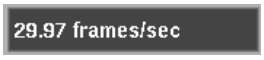
| Status boxes |
Flat black box (neither recessed nor raised).
|
Locked text that displays the status of a setting or
application parameter.
|
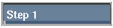
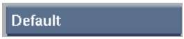
| Labels |
Flat grey box (neither recessed nor raised).
|
Labels, or categorizes, the items that lie under it. |


