The Customize Ribbon dialog offers a wealth of tools for editing the modeling ribbon. You can use the mouse and keyboard to rearrange existing controls, rename them, and change their icons. More important, you can add controls based on almost any tool in 3ds Max, or new tools based on custom scripts.
You can also add custom tabs and panels whose contents are best suited to your own workflow. Each ribbon element, from tabs all the way down to individual tools, has a number of properties that you can define such as name, size, enabled status, and others. Also, you can set the Visible and Enabled status of most ribbon elements to be conditional based on the active context.
Using the Customize Ribbon dialog is straightforward: Drag commands and ribbon controls from the two sections on the left side of the dialog to the Existing UI hierarchy list in the center. Next, to edit settings for an item in the Existing UI list, highlight the item and use the Properties editor on the right side of the dialog. Property settings changes appear in the ribbon immediately, and you can save them to a custom ribbon file that you can then load later or send to teammates so they can also take advantage of your work.
While dragging, when the mouse cursor is over the Existing UI list, an arrow appears at the list location where the item will be dropped, if permitted. Also, any parent items highlight temporarily to indicate where in the hierarchy the item will appear. If you hold the mouse cursor for a few seconds over an element that can be expanded, such as a collapsed panel, the element’s hierarchy expands. If the current placement is not permitted, a “stop” icon appears at the mouse cursor:
When you release the mouse button, the item appears where the arrow was pointing. If nothing happens, you attempted to place the command in an unsupported position. For example, a separator must be placed on a panel or sub-panel; it cannot be the direct descendant of a tab.
Additional editing functions are available within the Existing UI list, as follows:
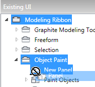
To create a shortcut to a particular ribbon panel:
Using features available on the Customize Ribbon and Customize User Interface (CUI) dialogs, you can set a keyboard shortcut, toolbar button, or menu item to open a specific ribbon panel. Twenty of these shortcuts are available. This procedure shows how to do it.
By default, the Ribbon Panel No. property for the panel is set to 0, which means that it’s currently unavailable for linking to a shortcut.
For example, on the Keyboard panel, assign a hotkey, or on the Toolbars panel, drag the action to a toolbar.
 Close the Customize User Interface dialog.
The panel appears at the mouse cursor. You can now use it the same way you would on the ribbon.
Example: To customize the ribbon, part 1:
The Customize Ribbon dialog provides a wide variety of tools for modifying the ribbon and creating new interface elements to suit your workflow precisely. This two-part procedure demonstrates some techniques you might find useful in doing so.
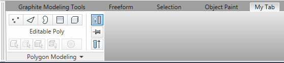
 Maximize the ribbon, if necessary, so you can see the contents of the Polygon Modeling panel on the Graphite Modeling Tools
tab.
Maximize the ribbon, if necessary, so you can see the contents of the Polygon Modeling panel on the Graphite Modeling Tools
tab.
 Customize Ribbon.
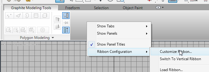
The Customize Ribbon dialog opens.
You can now see the names of the four default tabs on the ribbon.
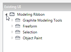
This is the only panel currently available on the Graphite Modeling Tools tab.
Next you’ll create an entirely new ribbon tab and populate it with a panel.
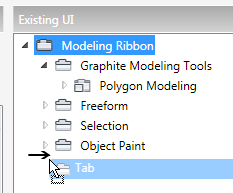
As you move the mouse over the Existing UI list, an arrow shows where the item you’re dragging will be dropped when you release the mouse button. If you pause for a few seconds over an expandable item, its hierarchy expands so you can then place the dragged item within the hierarchy. In this case, this is not desirable, so be sure to release the mouse button before the Object Paint hierarchy expands. If it does expand, release the mouse button (most likely nothing will be added), close the hierarchy, and try again.
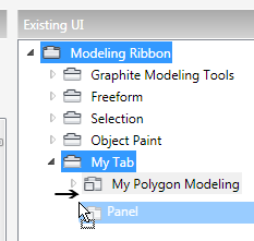
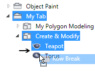
A new item named “New Tab” appears at the end of the list. Also, a tab with the same name has been added to the ribbon.
The Title property is defined as New Tab. This is the default name given to new tabs.
The new ribbon tab is now named “My Tab.”
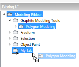
A copy of the Polygon Modeling panel item appears as a child of My Tab item. You can confirm the copy by clicking the My Tab tab on the ribbon. You’ve just populated your tab!
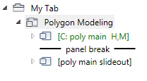
This level of the hierarchy contains two sub-panels separated by a panel break. (A sub-panel, which uses the  icon, is a section of a panel that usually contains related tools.) The first sub-panel, named [C: poly main H,M], contains
the visible part of the panel. The second sub-panel, after the panel break, contains the expansion that opens when you click
the panel title on the ribbon.
icon, is a section of a panel that usually contains related tools.) The first sub-panel, named [C: poly main H,M], contains
the visible part of the panel. The second sub-panel, after the panel break, contains the expansion that opens when you click
the panel title on the ribbon.
In this naming convention, the C stands for “conditional” and the H, V and/or M show the conditions: horizontal or vertical (ribbon orientation) and/or minimized. The naming convention can also reflect other conditions such as the current sub-object level.
The second part of this procedure covers conditional attributes.
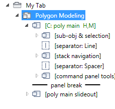
You can now see three more sub-panels nested within, with separators between each. These define the three areas within the Polygon Modeling panel, which are arranged horizontally. You’ll delete the center sub-panel, labeled [stack navigation], because, really, who needs to navigate the stack?
The [stack navigation] sub-panel has vanished from the hierarchy and from the copy of the Polygon Modeling panel.
The right-hand sub-panel, [command panel tools], moves slightly to the left.
So far you’ve learned how to create a new ribbon tab, how to populate it with a copy of an existing panel, and how to edit the panel. In the next part you’ll create a new panel and populate it with ribbon tools from existing 3ds Max commands.
Example: To customize the ribbon, part 2:
This procedure follows directly from the previous one; if you haven’t followed part 1, please do so now and then continue on to this one.
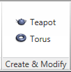
In this procedure you’ll create a new panel and populate it with commands to create objects and modify them.
A new panel with the default name New Panel appears in the list and on the ribbon.
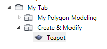
The Teapot command appears in the list and on the new panel in the ribbon. The name “Teapot” appears in the list, but not on the ribbon. However, the default icon appears in both places. You can change the image, if you like, with the Icon property; this procedure doesn’t cover the details.
Now the name “Teapot” appears next to the icon. The ribbon button has widened to fit both the icon and the label.
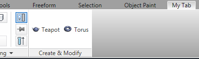
The two buttons sit side by side on the panel, which widens to fit. But what if you want them to be arrayed vertically?
Row Break works just like pressing Enter in a word processor, so the following content starts a new line. Now the two items appear in a vertical-list format, and the panel is more compact.
Next you’ll add a modifier that you can apply to any object.
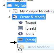
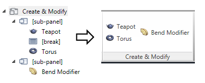
Now your Create & Modify panel provides a list of three items: two objects and a modifier. This presents a design problem, because objects and modifiers differ functionally. It’s best to separate them in the interface, even if they’re on the same panel. One way to do that is with the sub-panel control, which lets you create parallel sections on a panel.
If the second sub-panel appears as a child of the first (that is, indented), just drag it to the left to move it to the same hierarchy level as the other panel items.
Now the objects appear on the left side of the panel, while the modifier is on the right.
You might want to have different groups of related modifiers presented in drop-down lists; this is easily achievable with the Split Button control.
The modifier name appears on the split button and the modifier is applied to the selected object.
To save space on the panel, you can make the modifier split button appear only under certain conditions.
A drop-down list opens with the choices True, False, and Conditional.
The Conditions For Visible dialog opens. You use this dialog to specify the conditions under which the control will be visible; in other conditions, it doesn’t appear. You can reopen the dialog later to change the conditions by clicking the [...] button on the right side of the property.
This means the control will appear only when an editable poly object or an object with an Edit Poly modifier is selected. Of course, most modifiers can be applied to any geometry, so if you’re familiar with MAXScript, you could script that condition via the Maxcript field or the Open Editor button on the Conditions For Visible dialog.
Close the Conditions For Visible dialog and then select and deselect an editable poly or Edit Poly object in the scene to
make the drop-down list (split button) on the Create & Modify panel appear and disappear.
You can also set conditions for the Enabled property. In that case, if a condition isn’t met, the item is visible but not available (that is, grayed out).
(the Close button in the top-right corner).
3ds Max asks if you want to save the changes. If you click No, the program loads the default ribbon configuration. If you click Yes,
your edits are saved to the default ribbon and load whenever you restart the program. To return to the standard ribbon, right-click
the ribbon and choose Ribbon Configuration Reset Ribbon To Default.
In this two-part procedure you’ve learned how to modify the existing ribbon, add new components, and set conditions for visibility.
There’s much more to customizing the ribbon, of course; we encourage you to read the rest of this section and then experiment
on your own. Remember, you can always return to the default ribbon with the Ribbon Configuration Reset Ribbon To Default command on the ribbon right-click menu.
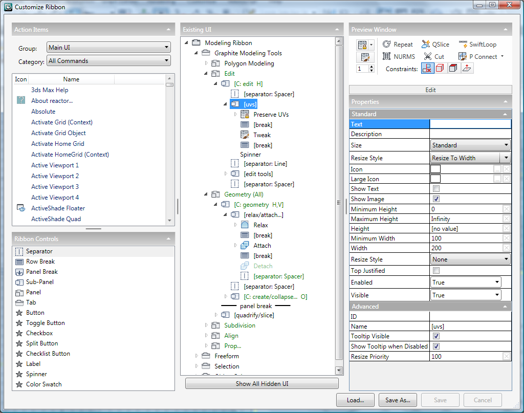
The Customize Ribbon dialog window functions like most other dialogs. To resize it, drag an edge or corner, and to reposition, drag the title bar. To collapse or expand a section, click the triangle at the right end of its header. To change the proportions between sections, drag the vertical or horizontal divider. Although the right-hand column contains sections, the Preview Window is a fixed size, so the only way to give the Properties section more vertical room is to collapse The Preview Window.
The dialog user interface comprises five main areas plus several buttons. This section describes the areas and, where necessary, provides links to sections with further explanation.
This section lists all the 3ds Max functions you can assign as ribbon controls, and provides most of the same features as the equivalent on the Customize User Interface dialog.
To add a command to the ribbon, first choose its group and category from the Group and Category lists, then find it in the Action list and drag it to the appropriate location in the Existing UI hierarchy in the center of the Customize Ribbon dialog.
When you add a command to the ribbon in this way, it creates a button. The behavior of the button depends on the nature of the command as defined in the software. For example, the button for a geometric primitive such as Box remains on when clicked, so that you can create several boxes in succession. On the other hand, a button for a modifier activates only momentarily, applying the modifier to the selected object.
Lists all user-interface elements (independent of specific commands) you can add to the ribbon. For descriptions of these, see Ribbon Controls.
A tree view, or hierarchical list, of the ribbon user interface. To expand or collapse a tree branch, click the arrow next to the parent item. The arrow for a collapsed branch appears as a gray outline pointing to the right; for an expanded branch, the arrow is black and points to the bottom-right.
By default, the list contains only features currently active in the ribbon. For example, if no object is selected, the Graphite Modeling Tools branch contains only the Polygon Modeling panel, but if an editable poly object is selected, a number of additional panels appear in that branch.
Alternatively, to display all ribbon contents regardless of the current program status, turn on the Show All Hidden UI toggle below the Existing UI list. Typically you’ll want to keep that off, though.
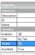
If an item’s name is green, its Available or Visible propertyhas been set to Conditional. For details, see Conditions dialog.
Shows the panel of the highlighted item in the Existing UI list, including the panel name. When a tab is highlighted in the list, no preview is available.
The preview window is interactive to a limited extent: Clicking an item highlights it in the Existing UI list and shows its properties in the Properties section. Similarly, clicking an item in the Existing UI list highlights its visual representation in the preview window. Also, hovering the mouse above a preview item shows the tooltip, if available. However, the preview window does not support changing settings or opening drop-down lists.
Shows all available settings for the highlighted item in the Existing UI list.
The Properties settings are self-documented with tooltips on the Customize Ribbon dialog, so they aren’t described in detail here. A few general notes, however:
The Ribbon Controls interface provides the available user-interface elements, including organizing elements such as tabs and panels, and the controls themselves. To add a control to the ribbon, drag it from the Ribbon Controls list to the Existing UI list.
The first six ribbon controls, which are used for organizing the ribbon, have specific icons that appear below and next to the control name on the Customize Ribbon dialog. These icons are “sticky” and remain the same even if you set a different icon via the Properties settings.
The remaining controls (Button through Color Swatch) have customizable icons and are thus marked with a generic star icon in the Ribbon Controls list. To set an icon for one of these, after adding it to the ribbon, set its Icon (and, optionally, Large Icon) property by clicking the ... button and choosing an ICO to represent the element. This icon then appears in the Existing UI list and on the ribbon.
 Separator
Creates a vertical divider between side-by-side elements within a panel or sub-panel. Typically you would place a separator between sub-panels to distinguish them as distinct areas.
To set the visual appearance of the separator, use the Style property. Two types of separator are available: The Line and None styles create a thin vertical line, and the Spacer and Invisible styles create a thin vertical space. You can adjust the width and height of a separator via its properties.
 Row Break
 Panel Break
Creates a separate area below the panel (or, in the vertical ribbon, to its side). When the ribbon is maximized, you access the controls after a panel break by clicking the panel name, which opens an expansion area adjacent to the panel.
When the ribbon is minimized, opening a panel displays all of its controls, including those after the panel break.
A Panel Break control cannot be made conditional, so if you place conditional elements after a panel break, the result could be an empty expansion.
Sub-PanelA sub-panel is a self-contained subgroup of controls within a panel or parent sub-panel. It works much the same as a panel (see following), except that by placing multiple sub-panels on a panel, you can create a neater arrangement of the panel contents.
A sub-panel acts like a column on a multi-column page of text, or in a spreadsheet. All the items on the sub-panel line up on their left edges, assuming you place a Row Break control between each pair of items.
You can find numerous examples of this usage on the default horizontal ribbon included with 3ds Max, as well as examples of nested sub-panels. For example, on the Freeform tab (make sure you have an editable poly object selected), the PolyDraw panel includes two sub-panels. If you expand the first one, [C: polydraw H], you can see two [poly draw tools] sub-panels at the end, separated by a Spacer separator. And if expand these, you can see how the two columns of controls on the right side of the PolyDraw panel, headed respectively by Shapes and Topology, are arranged.
You can nest sub-panels only once; in other words, you can put a sub-panel inside a sub-panel, but you cannot nest them any deeper than that.
 Panel
PanelA panel is a self-contained group of controls on a tab. Use the panel to organize related commands and properties into a single group. To save space, you can turn on the Collapsed property for a panel. You can also set a panel to be accessed quickly with a CUI shortcuts; for details, see this procedure.
By default, all controls in a panel appear in a row. To create multiple rows, insert row breaks. For example, to have a single column of controls on a panel, place a row break after each element except the last.
Or, to have a 2 x 2 arrangement of controls within a panel, place two controls, then a row break, and then two more controls. However, unless all of the controls as displayed on the panel are all the same size, this might lead to an uneven arrangement. For a more symmetrical look to your panels, use sub-panels, as described preceding.
 Tab
TabCreates an “empty” standard button as a placeholder for a specific command. A standard button typically is clicked once to invoke a command; an example is a button used to apply a modifier to an object.
Once you add a button, you can define a function for it by dragging a non-toggle action from the Action Items list to its Command property. You can also create a custom command by assigning a MacroScript to the Command property. For more information, see Advanced Usage.
Creates an “empty” toggle button as a placeholder for a specific command. A toggle button typically is clicked once to invoke a state, and then again to disable that state. An example of a toggle button is a button used to create an object primitive such as a box. Typically when creating a toggle button you would assign an alternate icon to emphasize the “on” state. An example in the ribbon is Show End Result.
Once you add a toggle button, you can define a function for it by dragging a toggle action from the Action Items list to its Command property. You can also create a custom toggle action for it with a MacroScript assigned to the Command property. For more information, see Advanced Usage.
Creates an “empty” check box as a placeholder for a specific command. A standard check box typically is clicked once to toggle a state; an example is the Full Interactivity check box on the Polygon Modeling panel.
Once you add a check box, you can define a function for it with a MacroScript assigned to the Command property. For more information, see Advanced Usage.
Creates a “container” for a drop-down command list. An example is the Paint On control on the Object Paint tab Paint Objects panel.
Once you add a Split Button control, populate it with child items by dragging the actions onto the Split Button control (see this procedure). You can also define a function for it with a MacroScript assigned to the Command property. For more information, see Advanced Usage.
Creates a “container” for a drop-down list of check boxes. An example is the Similar control on the Graphite Modeling Tools
tab Modify Selection panel.
Once you add a Checklist Button control, populate it with Checkbox controls by dragging them onto the Checklist Button control. You can also define a function for it with a MacroScript assigned to the Command property. For more information, see Advanced Usage.
Use to add a text descriptor or an icon (or both) for controls that don’t have their own labels, or whose default labels are disabled. An example of text label is the Contraints label for the row of buttons on the Edit panel. An example of an icon-only label is the icons for the color swatches in the Properties panel of a vertical ribbon.
Creates a standard spinner control consisting of a numeric field and up/down arrow buttons for changing the spinner value with the mouse.
Once you add a spinner, you can define a function for it with a MAXScript script assigned to the Maxscript property. For more information, see Advanced Usage.
Creates a standard color swatch control that the user clicks to edit the color using the Color Selector dialog.
Once you add a color swatch, you can define a function for it with a MAXScript script assigned to the Maxscript property. For more information, see Advanced Usage.
The Customize Ribbon dialog buttons provide controls for saving and loading ribbon configurations, plus toggling the display of all UI items.
By default, the Existing UI list shows only interface elements currently visible in the ribbon, based on conditions. For example, sub-panels with the Horizontal condition are usually hidden in the vertical ribbon. To make all ribbon elements available for editing, regardless of conditions, turn on Show All Hidden UI.
[close button]The close button is found in the top-right corner of the Customize Ribbon dialog, and, when clicked, closes the dialog. If you’ve made any unsaved changes, you’re prompted whether to save the changes.
If you click Yes, the changes are saved to the default ribbon-configuration file and the dialog closes. If you click No, any changes subsequent to the last save (or opening the dialog, if you haven’t saved) are discarded.
The Customize Ribbon feature is intended primarily for reorganizing the ribbon interface to suit your working methods and for adding existing 3ds Max commands from the Action Items list. While this feature provides for adding other types of custom controls such as check boxes and spinners, making these functional requires advanced knowledge and scripting ability, including writing MacroScripts.
Use the Conditions dialog to set conditions for enabling ribbon elements and controls or making them visible. The full name of the dialog is Conditions For Enabled, Conditions For Visible, or Conditions for Available, depending on the Customize Ribbon dialog property from which you invoked it.


