The tool for creating the rollup page portion the user interface of your plugin is the dialog editor of Visual C++ Developers Studio. You use the dialog editor to create the rollup page, and place and arrange the controls.
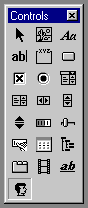
The custom controls are positioned in a rollup page like any other control. Each one is created using the Custom Control button. The Custom Control button is the one shown highlighted below.
The control is identified as being custom by filling in the Class field of the Custom Control Properties dialog box with an appropriate string indicating the type of control. To bring up this dialog, double click on the control in the dialog editor window.
These are the values to be used in the Class field of the Custom Control Properties dialog for those custom controls which may appear in a rollup page:
Custom Edit control - CustEdit
Custom Spinner Control - SpinnerControl
Custom Button control - CustButton
Custom Toolbar control - CustToolbar
Custom Image control - CustImage
Custom Status control - CustStatus
Color Swatch control - ColorSwatch
Custom Rollup Window - RollupWindow
Custom DragAndDrop Window control - DragDropWindow
The other fields in the user control properties dialog are these:
ID - This is the resource's identifier. The resource ID is usually a symbol supplied by Visual C++ and defined in the .H file that Visual C++ creates as part of your project. This is where you define the symbolic name for the resource.
Caption - This is the text that appears as part of the control to label it. This field is used for Custom Buttons and Status controls.
Visible - This determines whether or not the control is visible when the application is first run.
Disabled - This determines if the resource is displayed as disabled when the dialog box is created.
Group - This specifies the first control of a group of controls in which the user can move from one control to the next by using the arrow keys. All controls in the tab order after the first control with the Group property set to False belong to the same group. The next control in the tab order with Group set to True ends the first group of controls and starts the next group.
Tabstop - This specifies that the user can move to this control with the TAB key. This is only appropriate for the edit and button controls.
Class - The name of the control's Windows class. This class must be registered before the dialog box containing the control is created. See the class list above.
Help ID - Assigns a help ID to the control. The help ID is based on the resource ID. Type: Bool. Default: False.
Style - A 32-bit hexadecimal value specifying the control's style, primarily used to edit the lower 16 bits that make up a user control's sub-style.
ExStyle - A 32-bit hexadecimal value specifying the control's extended style.
When the rollup page dialog is created, it must be compiled and the resource file it generates must be included in the CPP source file. The default name for this file is RESOURCE.H. This may be changed by right clicking on the resource file name from the Resource View list (the top line) and choosing the Resource Includes... option. From this dialog, change the entry under Symbol header file.
Once you create a rollup page layout, there are several ways to present it to the user. The standard way is using a rollup page in the command panel. Typically, this is called from within BeginEditParams() when the user is in the position of editing an items parameters.
There is a method of the interface class to handle adding the rollup. Its called AddRollupPage(). The syntax looks like this:
hParams = interfacePtr->AddRollupPage(
   hInstance, // DLL instance handle.
   MAKEINTRESOURCE(IDD_CUSTCTRL), // ID of the dialog box.
   DialogProc, // Dialog procedure to process user input.
   ROLLUP_PAGE_TITLE, // Rollup title text.
   (LPARAM)this); // Saves the this ptr of the item
The standard width for rollup pages in the command column in the United States is 108 units. When you create dialogs for use in the command panel, always use 108 as the overall width (for use in the United States). Note the width and height are visible in the lower right hand corner of the IDE.
In summary, the custom controls are added to a rollup page layout using the resource editor window of VC++. The Class field of the resource indicates which type of control you are creating. The finished rollup page layout is displayed to the user using the AddRollupPage() function.