


Control attributes allow you to tweak the appearance of the control items on the property page. From the PPGLayout or PPGLayout object you can get each PPGItem or PPGItem (via the PPGLayout.AddItem or PPGLayout::AddItem method when you are adding them to the layout or by using the PPGLayout.Item or PPGLayout::GetItem property if you are modifying the layout via property page events) and then use the GetAttribute and SetAttribute methods to set such physical features as its width and height, whether or not there's a label, etc. These attributes can also be used to specify control-specific features, such as the file filters to use on a file widget (siControlFilePath) or basic aspects, such as which numeric widget to use (a thumbwheel, a slider, etc.) for a numeric parameter (siControlNumber). For a detailed list, please see siPPGItemAttribute.
This example demonstrates how to change control attributes both while building the property page as well as how to change them dynamically (via property page logic).
// Set up the underlying parameters
var oPSet = Application.ActiveSceneRoot.AddProperty( "CustomProperty", false, "Demo" );

oPSet.AddParameter3( "FileDemo", siString );
oPSet.AddParameter3( "NumberDemo", siDouble );
oPSet.AddParameter3( "Mute", siBool );

// Set up the PPGItems on the layout
var oPPGLayout = oPSet.PPGLayout;
var oParamStr = oPPGLayout.AddItem( "FileDemo", "FileDemo", siControlFilePath );
var oParamDbl = oPPGLayout.AddItem( "NumberDemo", "NumberDemo", siControlNumber );
var oParamBoo = oPPGLayout.AddItem( "Mute", "Mute", siControlBoolean );
This is what the property page would look like at this point:
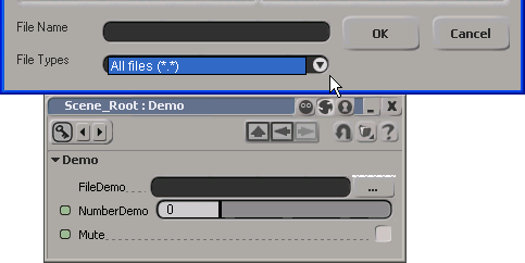
Notice how the slider is full length and the file filter offers only All Files (*.*). If you display a property set that has no layout defined, Softimage decides which controls to use and how to lay them out on the property page.
Now explicitly set up the controls using the PPGLayout or PPGLayout object:
// For the file widget, set the file filter to *.pic and *.bmp
oParamStr.SetAttribute( siUIFileFilter, "Softimage PIC files (*.pic)|*.pic|Bitmap files (*.bmp)|*.bmp|All Files (*.*)|*.*||" );

// For the number control, specify # of decimals and use treadmill widget
oParamDbl.SetAttribute( siUIDecimals, 3 );
oParamDbl.SetAttribute( siUITreadmill, true );

// For the check box, decrease the width
oParamBoo.SetAttribute( siUIWidthPercentage, "50" );
// (equivalent to oParamBoo.WidthPercentage = 50;)
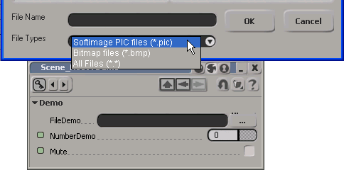
Here is the result of the changes to the file filter, the number control and the check box:
Finally, add some logic which will change the siUIContinue attribute on the number control dynamically (via the OnClicked button event):
// Add a click event to the button which will demonstrate
// how to set these attributes via property page logic
oPPGLayout.AddButton( "ChangeLayoutDemo", "Change Layout" );
oPPGLayout.Language = "JScript";
oPPGLayout.Logic = ChangeLayoutDemo_OnClicked.toString();
// This function toggles between displaying the number slider and
// check box on two lines vs. the same line
function ChangeLayoutDemo_OnClicked()
{
var oCtrl = PPG.PPGLayout.Item( "NumberDemo" );
if ( oCtrl.GetAttribute(siUIContinue) ) {
oCtrl.SetAttribute( siUIContinue, false );
} else {
oCtrl.SetAttribute( siUIContinue, true );
}
PPG.Refresh();
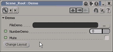
}So clicking the Change Layout button will toggle between these two states:
 Except where otherwise noted, this work is licensed under a Creative Commons Attribution-NonCommercial-ShareAlike 3.0 Unported License