RGB Color controls display a preview pane, the RGB/HLS/HSV toggle button, a numerical edit box and a color slider along with an optional animation divot and an optional label. They are associated to three underlying Float or Double parameters.
To provide a valid value range for your slider, set the Parameter.Min or Parameter::GetMin and Parameter.Max or Parameter::GetMax properties when you create each parameter.
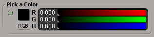
You create them using the PPGLayout.AddColor or PPGLayout::AddColor method (RGB is the default for type of color control):
// during parameter definition (for example, in the DefineLayout callback)
oCustomProperty.AddParameter3( "MyRed", siDouble, 0, 0, 255 );
oCustomProperty.AddParameter3( "MyGreen", siDouble, 0, 0, 255 );
oCustomProperty.AddParameter3( "MyBlue", siDouble, 0, 0, 255 );
// ...

// during control creation (for example, in the DefineLayout callback)
var oItem = oLayout.AddColor( "MyRed", "Pick a Color" );
You can also use the PPGLayout.AddItem or PPGLayout::AddItem method with the siControlRGB control type enum, but the PPGLayout.AddColor or PPGLayout::AddColor method is a little more convenient.


