UiUtilities.CollapseUi Class Reference
Detailed Description
This component creates a title and a sizer for sub controls.
The title acts as a switch to collapse (hide) or expand (show) all the sub controls.
Using this component supports nested collapse regions.
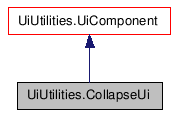
Inheritance diagram for
UiUtilities.CollapseUi:

Public Member Functions |
|
| __init__ () | |
| If sectionTitle is True, the title will have
an expandable background image that used to separate the UI sections. |
|
| add () | |
| doCollapseCallback () | |
| onTitleChange () | |
| setCollapseCallback () | |
| collapse () | |
| expand () | |
| isCollapsed () | |
| Show () | |
| ShowTitle () | |
| SetTitle () | |
| GetSizer () | |
| GetCheckbox () | |
Member Function Documentation
| UiUtilities.CollapseUi.__init__ | ( | ) |
If sectionTitle is True, the title will have an expandable background image that used to separate the UI sections.
If not, the title will only have a toggling triangle and a literal label.
If showTitle is True, the title will show. Hidden if not.
Reimplemented from UiUtilities.UiComponent.
| UiUtilities.CollapseUi.add | ( | ) |
| UiUtilities.CollapseUi.doCollapseCallback | ( | ) |
| UiUtilities.CollapseUi.onTitleChange | ( | ) |
| UiUtilities.CollapseUi.setCollapseCallback | ( | ) |
| UiUtilities.CollapseUi.collapse | ( | ) |
| UiUtilities.CollapseUi.expand | ( | ) |
| UiUtilities.CollapseUi.isCollapsed | ( | ) |
| UiUtilities.CollapseUi.Show | ( | ) |
| UiUtilities.CollapseUi.ShowTitle | ( | ) |
| UiUtilities.CollapseUi.SetTitle | ( | ) |
| UiUtilities.CollapseUi.GetSizer | ( | ) |
| UiUtilities.CollapseUi.GetCheckbox | ( | ) |
