The following diagram shows the Full Body view in the CharacterControlsConfig.xml file and highlights its main elements.
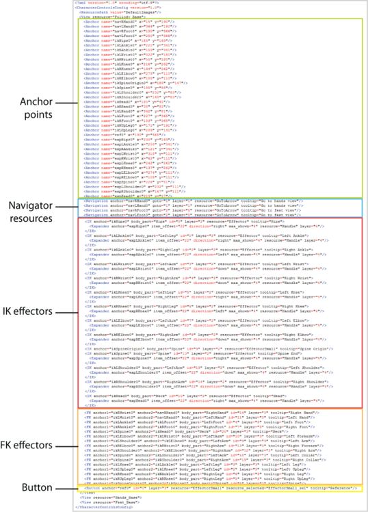
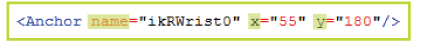
The configuration file is built upon the concept of anchor points, 2D x and y coordinates that are used to define the location of other elements in the layout.
You can attach a navigator resource or an IK effector to an anchor point.
Navigator resources represent the buttons that allow you to open a different view in the layout  .
.


| Attribute | Description |
|---|---|
| <anchor> | Identifies the anchor point that defines the location of the IK effector. |
| <body_part> | Identifies the body part keying group for the IK effector. For example, LeftLeg, RightLeg, RightArm, or LeftArm. See Manipulation and keying modes. |
| <id> | The internal ID for the IK effector. |
| <layer> | This number corresponds to the layer that is assigned to the IK effector. |
| <resource> | The name of the image that is used for the IK effector. |
| <tooltip> | Annotation text for the IK effector. This text displays when you hover over the IK effector in the layout. |
You can attach an effector handle to an IK effector. <Expander> elements have the following attributes:

FK effectors are procedural and are not image-based. Two anchor points are used to define the start and end of the effector.

| Attribute | Description |
|---|---|
| <anchor1> | The anchor point that defines the location in the layout where the effector starts. |
| <anchor2> | The anchor point that defines the location in the layout where the effector ends. |
| <body_part> | The body part keying group for the FK effector. For example, LeftLeg, RightLeg, RightArm, LeftArm. See Manipulation and keying modes. |
| <id> | This number is the internal ID assigned to the FK effector. |
| <layer> | This number corresponds to the layer that is assigned to the FK effector. |
| <tooltip> | Annotation text for the FK effector. This text displays when you hover over the FK effector in the layout. |
The <Button> element is used in the CustomRigControlsConfig.xml file instead of the <IK> element, but it has many of the same attributes:

| Attribute | Description |
|---|---|
| <anchor> | Identifies the anchor point that defines the location of the button. |
| <id> | The internal ID for the button. |
| <layer> | This number corresponds to the layer that is assigned to the button. |
| <resource> | The image used when a cell is not selected. See Cell status. |
| <resource_selected> | The image used when a cell is selected. See Cell status. |
| <resource_active> | The image used when a cell is assigned. See Cell status. |
| <tooltip> | Annotation text for the Button. This text displays when you hover over the button in the layout. |


