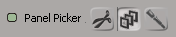
Icon button controls display a group of bitmap icons that the user can select along with an optional animation divot and an optional label. They are associated to an underlying parameter of any numeric type.
You create them using the PPGLayout.AddEnumControl or PPGLayout::AddEnumControl method with the siControlIconList control type enum.
// 1D array of iconpath,value pairs
var path = XSIUtils.BuildPath(
	Application.InstallationPath(siFactoryPath),
	"Application", "layouts", "bitmaps"
);
var aListItems = new Array(
	path+"\hairpanel.bmp",				0,
	path+"\toolbar_highlight.bmp", 	1,
	path+"\weightpanel.bmp",			2
);

oLayout.AddEnumControl( "PanelPicker", aListItems, "Panel Picker", siControlIconList );
You can also use the PPGLayout.AddItem or PPGLayout::AddItem method with the siControlIconList control type enum, but the PPGLayout.AddEnumControl or PPGLayout::AddEnumControl method is a little more convenient.


