Command entry:
Customize menu

Customize User Interface
Colors tab
The Colors panel of the Customize User Interface dialog allows you to customize the look of the 3ds Max interface. You can adjust the colors for almost every element in the interface, giving you the freedom to design your own
unique style.
The quad menu colors cannot be customized from the Color panel. To customize quad menu colors, use the Advanced Quad Menu Options dialog.
Procedures
To change an interface element color:
- From the Elements drop-down list, choose the category of the interface element whose color you intend to change.
- In the list below the Elements field, highlight the element whose color you intend to change.
The Color swatch shows the current color of the element.
- Click the Color swatch and then use the Color Selector dialog to choose a new color. Click the Close button to set the color.
To restore the color that was active at the time that you opened the dialog, highlight the element and click Reset.
- Continue choosing elements and changing colors as necessary.
- To finish and apply the color changes to the interface, close the dialog by clicking the X button in the upper-right corner.
TipIf you change several colors and then want to restore all colors to the default values, click the Load button and open DefaultUI.clr .
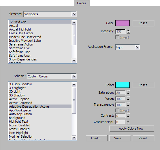
Interface
- Elements
-
Displays a drop-down list that lets you select from the various high-level groupings: Character, Geometry, Gizmos, Viewports,
and more.
- [UI elements list]
-
Displays a list of the available elements in the active category.
- Color
-
Displays the color for the selected category and element. Click to display the Color Selector, where you can change the color.
After choosing a new color, click Apply Colors Now to make the change in the interface.
- Reset
-
Resets the color of the highlighted element to the value that was active when you opened the dialog.
- Intensity
-
Sets a grayscale value for the display of the grid lines. 0 is black and 255 is white.
This control is available only when you choose the Set By Intensity option from the Grids element, and affects the intensity
of the grid lines in the viewports.
- Invert
-
Inverts the grayscale value for the display of grid lines. Dark gray becomes light gray and vice-versa.
This control is available only when you choose the Set By Intensity option from the Grids element.
- Application Frame
-
Sets the background color of the Caption bar and Graphite Modeling Tools interface elements. Choose Light or Dark from the drop-down list.
This control is available only when you set Scheme (see following) to Custom Colors.
- Scheme
-
Allows you to choose whether the main UI colors are set to the default Windows colors or whether they can be customized. If
Use Standard Windows Colors is active, all of the elements in the UI Appearance list are disabled, and you are unable to customize
the UI colors.
To inherit the active Windows interface theme, such as Windows Aero, set Scheme to Use Windows Theme.
- [UI appearance list]
-
Displays all the elements in the user interface that can be changed.
- Color
-
Displays the color for the selected UI appearance item. Click to display the Color Selector dialog, where you can change the
color. After choosing a new color, click Apply to make the change in the interface.
- Reset
-
Restores the highlighted UI appearance item to its color when you first opened the dialog.
- Saturation
-
Sets a saturation scale of enabled or disabled icons in the UI. The higher the saturation, the less gray the color. See Red, Green, Blue / Hue, Saturation, Value.
This control is only available when Icons: Enabled or Icons: Disabled is highlighted in the UI Appearance list.
- Value
-
Sets the value scale of enabled or disabled icons in the UI. The higher the value, the brighter the color. See Red, Green, Blue / Hue, Saturation, Value.
This control is available only when Icons: Enabled or Icons: Disabled is highlighted in the UI Appearance list.
- Transparency
-
Sets the transparency value scale of enabled or disabled icons in the UI. The higher the value, the more opaque the icon.
This control is only available when Icons: Enabled or Icons: Disabled is highlighted in the UI Appearance list.
- Invert
-
Inverts the RGB value for the display of enabled or disabled icons in the UI.
This control is available only when Icons: Enabled or Icons: Disabled is highlighted in the UI Appearance list.
- Contrast
-
Adjusts the scale of contrast boost for graphic buttons (buttons with an icon).
This control is available only when Icons: Enabled or Icons: Disabled is highlighted in the UI Appearance list.
Contrast and Gradient Map are meant to improve button appearance. Typically, they default to 100 for a dark color scheme such
as ame-dark.clr, and to 0 for a light color scheme such as ame-light.clr.
- Gradient Map
-
Adjusts the scale of color gradient mapping for graphic buttons (buttons with an icon).
This control is available only when Icons: Enabled or Icons: Disabled is highlighted in the UI Appearance list.
Contrast and Gradient Map are meant to improve button appearance. Typically, they default to 100 for a dark color scheme such
as ame-dark.clr, and to 0 for a light color scheme such as ame-light.clr.
- Apply Colors Now
-
Activates any changes in the user interface.
- Load
-
Displays the Load Color File dialog. Allows you to load custom color (CLR) files to use in the 3ds Max interface.
- Save
-
Displays the Save Color File As dialog. Lets you save changes to the user interface colors in a CLR file.
- Reset
-
Restores the default setup (defaultui.clr).